Proyecto

Frutto

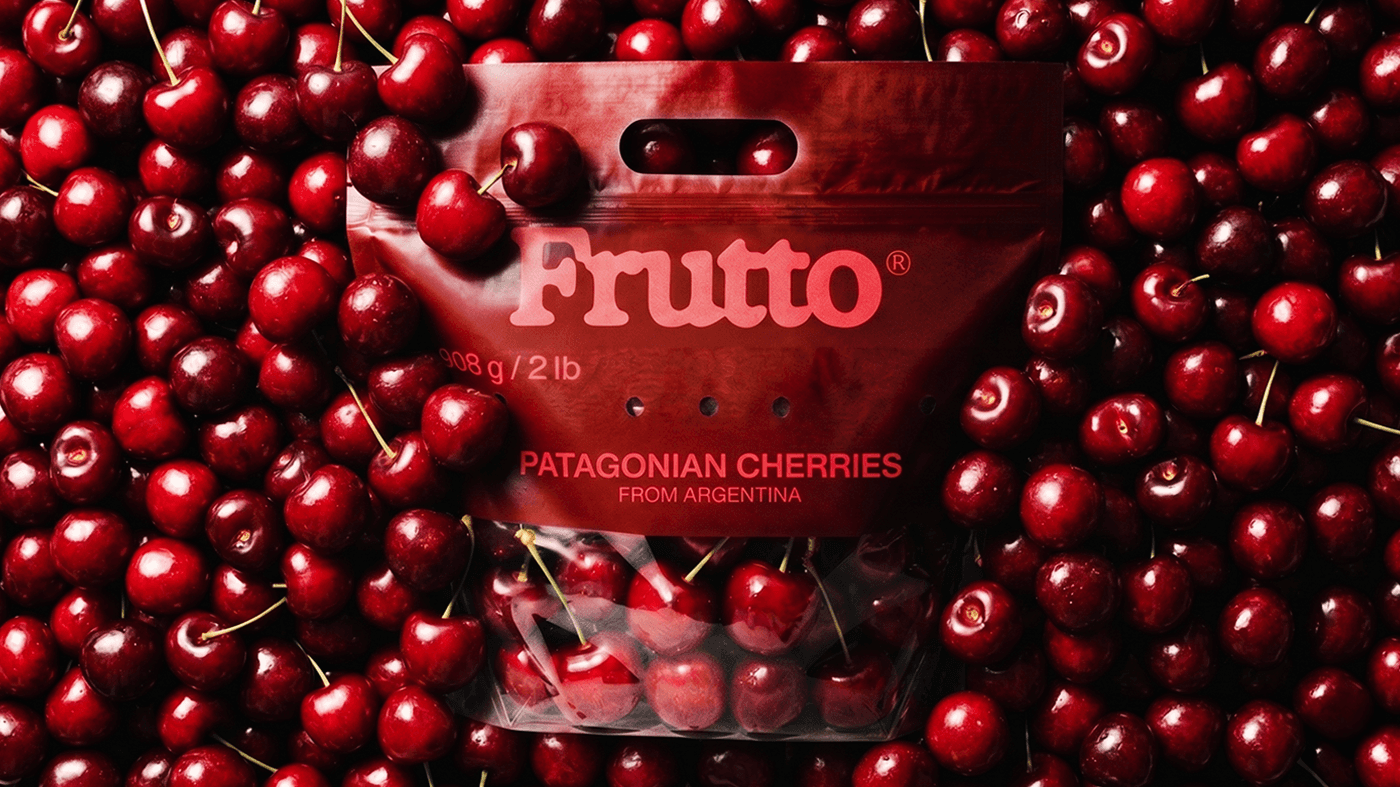
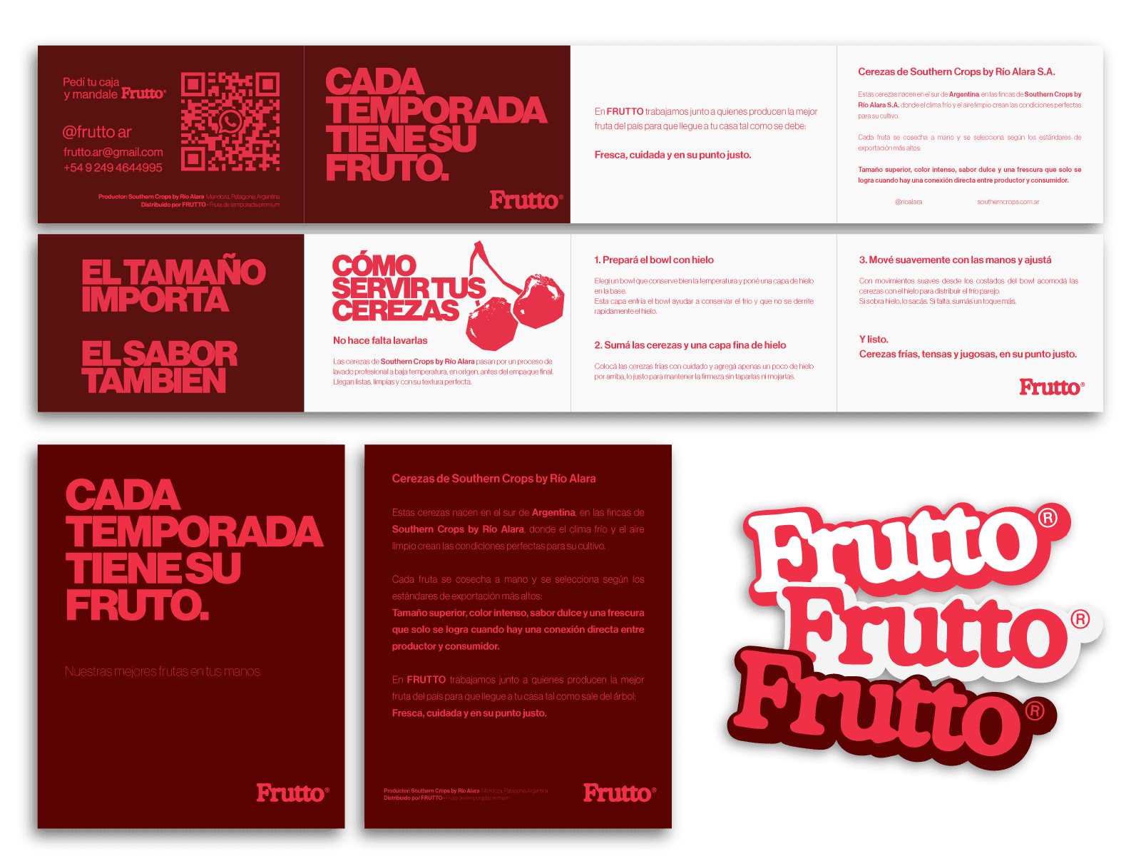
Frutto conecta la mejor fruta de exportación argentina con el consumidor local. Desarrollamos su sistema de identidad completo —logo, colores, fotografía, tono de voz y packaging— transmitiendo calidad premium con la calidez y cercanía que la marca exige.

Services

Brand Identity

Visual Design

Brand strategy

Year

2026

Client

Frutto.ar

Frutto
Deadpan wordmark on black: bold white “Deadpan” in italic sans-serif, preceded by a distressed white smiley face logo (crossed-out eyes, tongue sticking out) on a solid black field.
White outline of a classic smiley face followed by the text “Smiley Co” in white serif type on a vivid orange background.
Orange outline of a smiley face with the text “Smiley Co” in orange serif type on a clean white background.
Rectangular packaging box with a pale yellow-to-orange gradient, featuring a large half-smiley face and “Smiley Co” branding, set on a split orange and yellow background.

Humanizar y hacer accesible la fruta de calidad de exportación.

Tiled pattern of small white Deadpan icons—including toilets, rainbows, skulls, plungers and spray bottles—scattered across a solid black background.
Black bucket hat floating against black, embroidered at the front with the distressed white Deadpan smiley face logo (X eyes, tongue out).
Three slim, upright orange packaging boxes side by side, each showing a partial black smiley face and “Smiley Co” text on the top, with a matching orange background.
Modern home office setup with a monitor, ergonomic chair, keyboard, and indoor plants near a window with blinds.